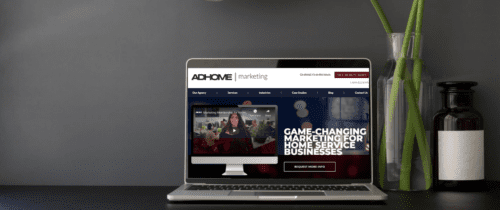
Your website’s homepage is like the first handshake with a potential customer. As you know, you can tell a lot about someone through a handshake. Similarly, you can tell a lot about a company by looking at their homepage. Creating a strong foundation on your landing page allows for an impressive, functional website that will attract more customers to your service and fill your schedule.
It takes seven seconds for you and your business to make a long-lasting first impression. People are quick to lose interest; if they don't see everything they need right away they will click off. By earning the scroll, the “hero area” (also known as the main banner section) of your website has interested them enough to inquire further. This is the role of your homepage, and you want it to work.
To see these principles in action, check out the homepage of our website. If you take complete advantage of this information you can ensure your landing page will knock it out of the park every time.
Earn The Scroll
If a company's homepage is cluttered and unorganized, no matter how skilled they are at roofing your house, or installing your electrical systems, web visitors are more likely to switch to a competitor's website. A comprehensive website demonstrates that you know exactly what you’re talking about and sets a foundation of trust with your customer.
What a customer immediately sees on the website without scrolling is extremely important, this is referenced to as above the fold.
There are a couple of key aspects of your landing page that are the driving force in attracting customers to choosing you as their service provider.
Looking Professional
Brand focused custom photography can be an extremely effective tool in piquing your viewer's interest. Images bring the brand to life, including pictures of your technicians on the job can help push an aura of professionalism and security for your customers. Using tools like custom photography can only be as effective as you make them. Understanding who your target audience is and what interests them is crucial. It will help you capitalize on the visits you're already paying for by getting more users to convert into customers. So make sure any photos on your website will appeal to your target audience.

The Easier The Better
Consumers like things easy; the more accessible you make your service the more likely they are to book with you. A phone number prominently displayed on the website constantly reminds the viewer that you are easily accessible to inquire about your services. Utilizing an automated response system to quickly converse with prospecting customers will streamline your process.
Due to the nature of the industry, a large amount of information needs to be present to detail the methods and tools your company uses. Having easy access to this information is crucial to a good homepage. More importantly, use clear and simple wording to explain your services. Consumers of these services are already on guard, don’t further intimidate them with elaborate and complicated terminology that will only hinder them from wanting to get serviced.
Give Yourself Credit
If your company has won awards or you have guarantees that you stand by, show them off, make sure your customers are aware of them. Not only does that build a sentiment of confidence with clients but gives your company memorable attributes that may push on-the-fence buyers towards your service.
Your awards and guarantees should be prominently placed at the top of your website or above the fold. Therefore when your website is clicked on, the first thing they see is how successful and committed you are to doing a good job.
Conclusion
In the ever-changing world of the internet, having a robust online presence is guaranteed to increase the number of customers choosing your company for their home services. A strong homepage creates a solid foundation to uphold the rest of your website and promote your company. The more people that are intrigued by your homepage, the more people that will be calling and emailing you to arrange a possible consultation for your service. The major takeaways are developing a clean and efficient website, displaying attractive aspects of your business above the fold, and displaying your information directly and accessible. Get ahead of your competition, you have to kill it with your homepage.
Last tip: Don’t just stop at your homepage! If you're driving traffic to a service page, then you need to look at your service page the same way you just analyzed your home page. Any landing pages that your ads are driving traffic should be to be built to convert.
Need help with your website? Get a free website audit.

